
Understanding Color In Photography
Color is a product of reflection.
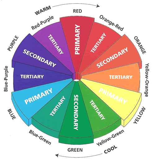
The Color Wheel
The color wheel is a circular scheme that visually represents the relationships between colors.
Primary colors (3) are the only colors that can’t be made by adding or mixing other colors together (pure colors). All other colors are created by combining these primary colors.
RYB color model (common color model):
- Red
- Yellow
- Blue
RGB color model (digital world):
- Red
- Green
- Blue
CMY color model (printers and designers):
- Magenta
- Yellow
- Cyan
Secondary colors (3) are created by combining exactly half of two primary colors. Each secondary color is directly opposite a primary color on the wheel (The relationship is called complementary)
- Purple: 1/2 Red + 1/2 Blue
- Orange: 1/2 Red + 1/ Yellow
- Green: 1/ Blue+ 1/2 Yellow
Tertiary colors (6) (intermediate colors) are made by mixing 25/75 or 75/25 combination of primary and secondary colors.
- Blue-Purple (Violet): 1/4 Blue + 3/4 Purple (OR 3/4 Blue + 1/4 Purple)
- Red-Purple (Magenta): 1/4 Red + 3/4 Purple (OR 3/4 Red + 1/4 Purple)
- Red-Orange (Vermilion): 1/4 Red + 3/4 Orange (OR 3/4 Red + 1/4 Orange)
- Yellow-Orange (Amber): 1/4 Yellow + 3/4 Orange (OR 3/4 Yellow + 1/4 Orange)
- Yellow-Green (Chartreuse): 1/4 Yellow + 3/4Green (OR 3/4 Yellow + 1/4Green)
- Blue-Green (Teal): 1/4 Blue + 3/4 Green (OR 3/4 Blue + 1/4 Green)
Complementary Color Pairs:
RYB and CMY models:
- Red and Green
- Yellow and Purple
- Blue and Orange
- Green and Magenta
- Red and Cyan
- Blue and Yellow.
Ex. Red is the opposite of Cyan:
- when add Red and Cyan together we make neutral color.
- When we remove red from the photo, we are actually adding cyan to the photo.
- When we add red to the photo, we are actually removing cyan from the photo.
- When we add half red and half cyan, we have neutral.
Color Space (sRGB vs Adobe RGB)
Color space refers to the color range that can be displayed by a photograph. Every image displays a spectrum of color.
sRGB displays consistently across all devices and is simple to work with. Adobe RGB gives you a more comprehensive range of saturated color to work with if you want to print your work professionally.
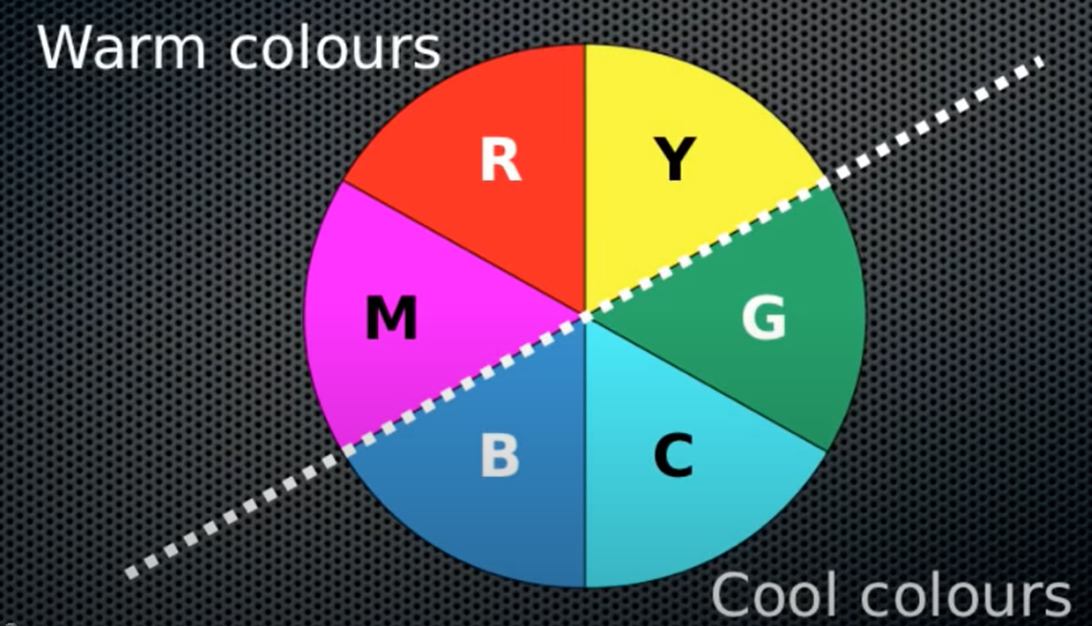
Concepts of Cool/Warm/Neutral Colors
- Cool: Any photograph that has got bluish tones is sad to be cool.
- Warm: Any photograph that has red or orange tones is said to be warm.
- Neutral: A photograph with no tones while all the colors appear to be true is sad neutral.
Color Temperature
Color temperature is measured in units of Kelvin (K) and is a physical property of light.
A neutral color temperature (sunlight at noon) measures between 5200-6000 K
- Daylight: 5600k - white color
- Minimum Setting on camera: 2500k - colder color (blue)
- Maximum setting on camera: 10000k - warmer color (red)
Here’s a chart that gives you a few different light sources and their typical range of Kelvin measurements:
- Household Lighting: 2500k to 3500k
- Sunrise and Sunset: 3000k to 4000k
- Sunlight and Flash: 5200k to 6000k
- Clear Sky: 6000k to 6500k
- Cloudy Sky and Shade: 6500k to 8000k
White Balance
White balance balances the color temperature in your image. It adds the opposite color to the image in an attempt to bring the color temperature back to neutral.
We need to tell the camera that under any given lighting, this is white. Once we tell the camera that, all other colors falle into place. That is what we call white balance.
How to manually ajust the white balance: One way to get the right color balance is to use a gray card or white card to ensure you are getting the correct white balance.
Neutral means that all three color channels, R, G, B, are equally represented in the images. This can range from 1% to 99% gray. Technically 0% and 100% are neutral in color but there are no image details at those values.
In an 8-bit/channel space, the RGB values for 18% grey is 46/46/46 (256 x 0.18).
LAB Model
- L: Lightness
- A: Green-Red
- B: Blue-Yellow
Contrast
Contrast means difference between the darker parts and the bright parts of your image.
The most common differences are achieved by changes in the tones or colors that compose the image.
Texture
In photography, texture is the visual depiction of variations in the color, shape, and depth of an object’s surface. Texture is simply defined as the way we capture the depth of a surface.
Tonal and Color contrast are highly effective for capturing textures in an image.